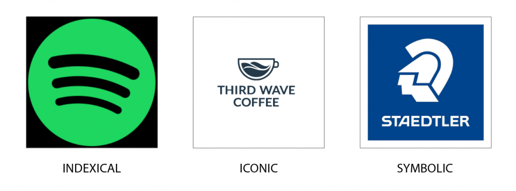
According to Charles Pierce (Nodelman, 2023), signs can be classified into three categories, Icon, Symbol and Index. Icons are those that have a direct correlation to the message they stand for, David Crow in Visible Signs chapter 2 (Crow, 2007) references a photograph of a person as an example; the photograph directly resembles and signifies the person. In design, icons are often used to create a seamless connection that is translatable to any person worldwide. Indexes are signs that have an indirect correlation; for example, a claw mark might resemble a wild animal like a bear, or a sign of smoke would indicate fire. Symbols seem to be the most complex of all, and do not have any correlation to the signified. Symbols require a pre-conceived understanding of the connection, and an example would be alphabets. The viewer only understands a string of alphabets when they know beforehand what each alphabet signifies.
In the brand identity workshop, I was tasked to first choose a brand logo that fit into the thew three categories. I chose Third Wave Coffee, Spotify, and Staedtler. Third Wave Coffee is a brand based in India, and their logo is a mug with three waves representing coffee. To me, this seems to best fit an iconic logo as it directly connects to the product sold. It can be argued that it fits within an Index as well, given that a mug only has an indirect connect to coffee. My choice for Indexical logo was that of Spotify. The platform provides music streaming services, and the three bands used provide an indirect connect to the streaming service. As for Staedtler, it now only uses their wordmark but their older logos had the head of Mars, which has zero connection to their product. As the company’s full name is Staedtler Mars GMbH, they went forward with the head of Mars, and only if the connection is visualised will a viewer know next time that the logo stands for Staedtler.
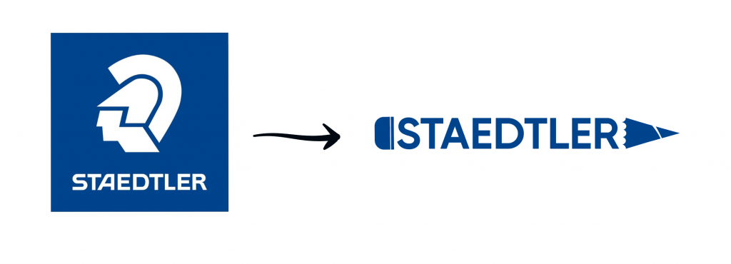
Our next activity was to redesign one of the three to switch its categories. I redesigned the Staedtler logo to fit into iconic. Using the theories of semiotics, I designed the wordmark to fit into a silhouette of a pencil, creating a direct connection their product; stationery.
My biggest learning from this workshop is that the categorization of signs when it comes to branding is fluidic, logos can fit within the gaps of two types. I find it difficult to choose an exact type for the logos that I have researched, but the understanding of semiotics does provide a better basis of creating brand identity and making strategic choices for design.
Leave a Reply